
TL;DR
A lead-generation landing page is a standalone page built around a single conversion goal. Dedicated landing pages convert far better than homepages because they remove distractions and match the visitor's intent. The median landing page converts at 6.6% across industries (Unbounce, Q4 2024). A "good" rate is 10%-plus and top performers hit roughly 11% or more.
The highest-leverage, evidence-backed changes are: one focused CTA (single-CTA pages convert at 13.5% vs 10.5% for pages with five or more links), fewer form fields, faster load times (a 1-second page converts roughly 3x better than a 5-second page for lead gen), removing navigation, and adding social proof near the form.
The "best" landing page is the tested one. Most figures below are directional benchmarks that vary widely by industry, traffic source, and offer, so treat them as starting points and validate with A/B testing and analytics.
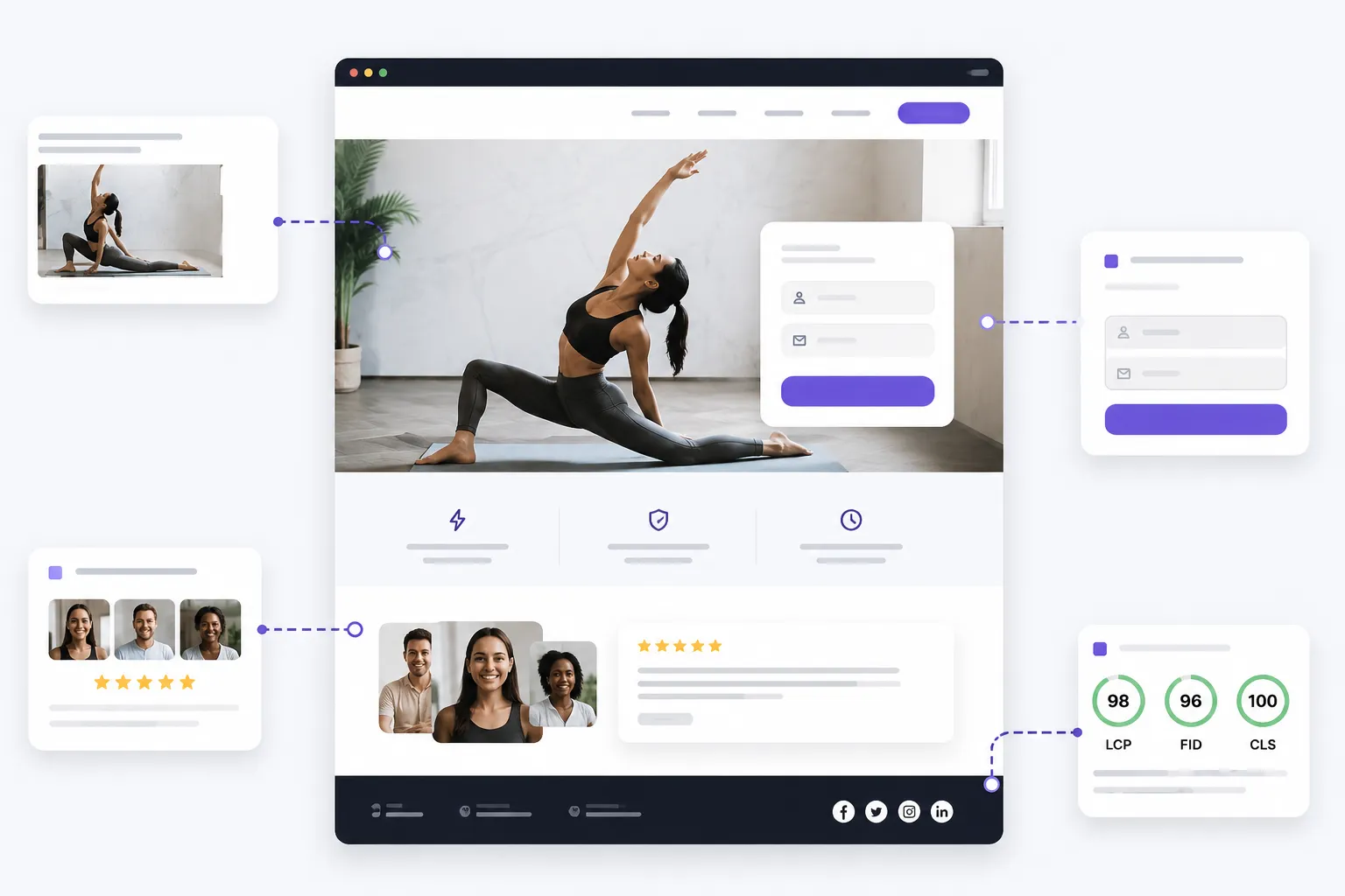
Annotated landing page mockup with one CTA, short form, social proof block, and Core Web Vitals badges
What a landing page actually is, and why it matters
A landing page is a standalone web page built for a single marketing goal, the place a visitor "lands" after clicking an ad, email, or search result. Unlike a homepage, which serves many audiences and goals and is full of navigation, a lead-gen landing page has one job: convert the visitor into a lead through a form fill, signup, demo request, or contact. The focus, the message match with the source that drove the click, and the single CTA are why dedicated landing pages convert better than general pages.
The data backs the "more pages" strategy. Per HubSpot, companies with 40-plus landing pages generate 12x more leads than those with 1 to 5, and increasing landing pages from 10 to 15 produced a 55% increase in leads. The logic: more targeted pages mean more chances to match the right offer to the right audience. The same "specific page for a specific intent" discipline shows up on the SEO side in our Next.js vs WordPress SEO guide and on the build side in our WordPress vs custom build guide: the platform shapes how quickly you can ship and iterate the next page.
Conversion benchmarks (ranges, not targets)
Overall median: 6.6% across all industries, per the Unbounce Conversion Benchmark Report (Q4 2024, based on 464 million visits to 41,000 pages, 57 million conversions). Unbounce uses the median rather than the average to avoid outlier skew.
By industry (Unbounce medians): SaaS 3.8% (lowest), events and entertainment 12.3% (highest), financial services 8.4%.
What "good" looks like: roughly 10% or higher. Top performers (top 10%) convert at about 11.45% or higher.
A conflicting figure to flag: WordStream and Ecommerce Bonsai cite a lower cross-industry average of 2.35%, which includes all page types, not just optimised dedicated landing pages. Both can be "correct" because they measure different things.
Traffic source matters more than industry: Unbounce found email traffic converts highest (around 19.3% median), paid social around 12%, paid search around 10.9%, display around 4.1%. Always segment by traffic source before comparing to a benchmark.
These are benchmarks that vary widely. The right comparison is your own page type, offer, and traffic source, not a generic internet average.
The anatomy of a high-converting landing page
Wireframe of a landing page hero with headline, subheadline, one CTA, hero image, then a band of three customer logos under the fold
Benefit-driven headline
The headline is what most visitors read first. David Ogilvy's classic line: "On the average, five times as many people read the headline as read the body copy. When you have written your headline, you have spent eighty cents out of your dollar." Copyblogger popularised the related rule that 8 out of 10 people read the headline but only 2 out of 10 read the rest. Prioritise clarity over cleverness, and lead with the outcome ("Save 10 hours a week on reporting") rather than a feature ("AI-powered analytics dashboard").
Supporting subheadline
Use it to elaborate on the headline, add the value proposition or unique selling point, and give one more reason to act.
Single goal and message match
Every campaign should have one goal, and the landing page should reinforce it. Match the page's language and promise to the ad or email that drove the click. Mismatch spikes bounce rates and wastes ad spend.
Strong, clear CTA
Best practices supported by data:
One CTA beats many. Single-CTA pages convert at 13.5% vs 10.5% for pages with five or more links (Unbounce, 18,639 pages). This is the "attention ratio" concept from Unbounce: aim for a 1:1 ratio of links to goals.
Copy matters more than colour. In an Unbounce / ContentVerve test, changing "Start your free trial" to "Start my free trial" (first person) increased clicks by 90%. This is one case study, not a universal law, but the direction is consistent: action verbs and benefit-focused first-person copy beat generic verbs. Try "Get my free quote" or "Claim my discount."
Colour equals contrast. The specific colour matters less than standing out from the surrounding page.
Placement. Above the fold and repeated at strategic scroll points. One goal repeated is not "multiple CTAs."
Personalisation. HubSpot analysed more than 330,000 CTAs over a six-month period and found that personalised CTAs convert 202% better than basic CTAs ("15 Call-to-Action Statistics"). Note: this is HubSpot's own internal data on its own properties. Treat the lift as directional.
Hero section and visual hierarchy
People scan in an F-pattern (Nielsen Norman Group eye-tracking research, first published 2006 and confirmed in 2017). Use whitespace, a clear visual hierarchy, and directional cues (arrows, eye-gaze) to guide attention toward the CTA and form.
Compelling visuals and video
Video on a landing page is widely cited to lift conversions by up to 80 to 86%. The figure traces to an EyeView Digital A/B test for TutorVista, where an autoplay-video landing page produced an 86% conversion lift. TutorVista manager Arun Kumar said, "We implemented EyeView's solution on one of our landing pages that already had an impressive conversion rate. The very first test they ran boosted conversion by over 80 percent" (via Smart Insights and Business2Community). Treat the ceiling figures as best-case. Real-world lift is more often in the 20 to 40% range. Avoid generic stock imagery. A truck driving school saw a 161% lift in form submissions after replacing a stock image with a photo of a real student (VWO case study).
Benefit-focused, scannable copy
Lead with benefits over features, keep copy concise, and use bullet points. Reading level matters: Unbounce found pages written at a 5th-to-7th grade reading level had an 11.1% median conversion rate, roughly double the 5.3% for college-level copy.
Social proof
Testimonials, reviews, trust badges, client logos, case studies, and numbers build credibility. Adding three lines of testimonial lifted conversions 34% in the VWO / WikiJob case study (treat as one case study, directional). Reviews are near-universal in the buying journey: BrightLocal's Local Consumer Review Survey 2026 (a representative panel of 1,002 US adults via SurveyMonkey) reports that "even in a world where people are more aware and more frustrated by the scourge of fake reviews, 97% of consumers still lean on reviews to guide their purchase decisions." Use specific, attributed testimonials (name, role, measurable result).
Trust signals
Security badges, guarantees, privacy assurances, and a "no spam" note near the form reduce anxiety. A Blue Fountain Media case study found that adding a VeriSign trust badge near a form increased conversions by 42%. CXL found security badges and certifications can increase conversions around 15%. Place trust signals near the form and CTA where anxiety peaks. Badge effects vary and can be neutral or even negative in some tests, so validate.
Lead capture form
Fewer fields generally convert better. Reducing fields from 11 to 4 increased conversions roughly 120% in the Imaginary Landscape case study, widely cited via HubSpot. HubSpot's analysis of 40,000-plus forms shows conversion dropping as fields increase, and reducing from four to three fields can lift conversions about 50%. Only ask for what you need now and collect more later via progressive profiling. Multi-step forms can help by reducing perceived effort.
Honest caveat from CXL and Michael Aagaard: "fewer form fields always wins" is a myth. Sometimes more fields qualify leads better or build trust. The right number is the one your test tells you.
Urgency and scarcity (honest)
Limited-time offers and limited spots can prompt action, but only when genuine. Fake countdowns erode trust faster than they lift conversion.
Remove navigation and distractions
Removing the navigation menu doubled conversions (3% to 6%) in a VWO / Yuppiechef case study. HubSpot's own tests showed lifts too (small on top-of-funnel pages, larger on mid-funnel pages). Keep visitors on the page and focused on the one action.
Page speed and performance
This is one of the strongest data-backed sections in the entire conversion playbook.
Google / SOASTA (2017). As page load time goes from 1s to 3s, bounce probability increases 32%. 1s to 5s, 90%. 1s to 6s, 106%. 1s to 10s, 123%.
Portent ("Site Speed is (Still) Impacting Your Conversion Rate," updated April 2022, around 100 million page views). "A site that loads in 1 second has a conversion rate 3x higher than a site that loads in 5 seconds" for B2B lead-gen sites (2.5x for e-commerce). For e-commerce, the highest conversion rates occur between 1 and 2 seconds, and conversion drops by an average of about 0.3% for every additional second of load time. Portent does not define which metric "seconds" refers to, so treat load time as approximate.
Deloitte / Google "Milliseconds Make Millions" (September 2020, 37 brands, 30-plus million sessions). A 0.1-second improvement in mobile site speed lifted retail conversions 8.4% (average order value +9.2%) and travel conversions 10.1%.
Core Web Vitals (LCP, INP, CLS) affect both rankings and conversions. Aim for LCP under 2.5 seconds and CLS under 0.1. We unpack the SEO half of this in our Next.js vs WordPress SEO guide, including the June 2025 CMS pass-rate rankings.
The mechanical wins: optimise images, lazy-load below-the-fold content, minimise scripts, and use fast hosting. The same hosting discipline we cover in our Hostinger VPS Node.js guide and Next.js on AWS guide applies cleanly here: the platform underneath caps how fast the page can ever get.
Mobile optimisation
Mobile is the majority of web traffic. StatCounter GlobalStats put mobile at 64.35% of global website traffic as of July 2025 (cited via SOAX). Note that StatCounter's quarterly figure excluding tablets fell to 52.27% in Q1 2026 per Statista, so cite a current dated figure when you publish. For landing pages specifically, Unbounce found 82.9% of visits come from mobile, yet mobile converts slightly lower than desktop (12.1% desktop vs 11.2% mobile in Unbounce's data). Closing this gap is a major opportunity. Use thumb-friendly CTAs, short forms, fast loading, and text that is legible without zooming. The same mobile-first lens applies whether you ship a PWA or a native app, as we cover in our PWA vs native apps guide.
Trust and social proof, in depth
Types of social proof: customer testimonials, reviews and star ratings, client logos, case studies, numerical metrics (users served, results delivered), trust and security badges, and media mentions. BrightLocal's 2026 survey found 97% of consumers lean on reviews to guide purchase decisions.
Placement matters. Client logos work above the fold to establish credibility. Testimonials placed within one scroll of the CTA overcome last-minute objections. Trust badges belong near forms and payment fields. Authenticity is critical. Specific, attributed proof outperforms generic praise, and a mix of reviews reads as more trustworthy than an all-perfect wall of five stars.
Copywriting for conversion
Be clear, benefit-driven, and address the visitor's pain points directly. Use "you" language and match visitor intent and the words your audience actually uses. Keep readability high (the 5th-to-7th grade level converted best in Unbounce's data). The value proposition should answer "what is this and what do I get" within seconds, ideally in the headline and subheadline.
The same plain-English discipline shows up in our AWS for non-technical founders guide: when the audience is busy, clarity beats cleverness every time.
A/B testing and optimisation
The "best" design is the tested one. Test headlines first (highest impact), then CTAs, forms, images, and layout.
Tools. Google Optimize shut down permanently on September 30, 2023, so any workflow built on it must be migrated. Current options: VWO, Optimizely, AB Tasty, and Convert.com. Free or technical options: GrowthBook and Statsig. Note that VWO and AB Tasty merged in January 2026, a move widely expected to push both further upmarket.
Analytics and heatmaps. Hotjar and Microsoft Clarity for heatmaps, session recordings, and scroll depth. Clarity is free.
Reality check. Only about 1 in 8 A/B tests produces a statistically significant winner (VWO), and you generally need enough traffic and conversions per variant to trust a result. Companies that test regularly see roughly a 37% average conversion improvement (VWO), yet only about 17% of marketers actively test. That is the single biggest gap between average and high-performing teams.
The validation discipline carries over from products. The same "set the threshold before you ship" logic in our SaaS validation playbook and our MVP vs full product strategy guide applies to landing-page tests: define the lift you need to call a winner before you launch the experiment, not after the data starts rolling in.
Common mistakes that kill conversions
Too many CTAs or competing options.
Slow load time.
A weak or confusing headline.
Asking for too much information.
No social proof.
Poor mobile experience.
Message mismatch with the ad or source.
Navigation links and other distractions.
Generic stock imagery.
No clear value proposition.
Walls of text.
A practical checklist
One clear conversion goal and one primary CTA (repeated, not competing).
Headline states the benefit in plain language. Subheadline adds the value prop.
Message matches the ad, email, or search that drove the click.
CTA copy is action- and benefit-oriented, ideally first person.
Navigation menu and external links removed.
Form asks only for what is necessary. Consider a multi-step form.
Social proof near the CTA (specific, attributed).
Trust signals near the form (privacy note, badges where relevant).
Hero visual is authentic and relevant (not generic stock).
Loads fast (aim under 2 to 3 seconds. Check Core Web Vitals).
Mobile-first, responsive, thumb-friendly, legible.
Copy is scannable (bullets, short paragraphs, roughly 5th-to-7th grade reading level).
A/B testing and heatmaps in place to iterate.
How Brandrums recommends approaching it
Step 1: ship the highest-ROI fixes this week. Strip navigation, consolidate to one CTA, cut the form to the fewest necessary fields, and get load time under 2 to 3 seconds. These are low-effort, high-impact, and well supported by data. The same scoping discipline we recommend in our web app design contract questions guide applies: agree on the change before you scope the sprint.
Step 2: strengthen persuasion this month. Rewrite the headline to a clear benefit, add one specific attributed testimonial near the CTA, replace stock images with authentic visuals, and add trust signals near the form. Our web app redesign checklist covers the broader page-level review process this fits inside.
Step 3: optimise continuously. Set up heatmaps (Hotjar or Microsoft Clarity) and an A/B testing tool (VWO, Optimizely, or AB Tasty). Test headline first, then CTA, then form. Define the lift threshold before you launch each experiment.
Benchmarks that should change the plan:
If your blended rate is below your industry median (for example, below 3.8% for SaaS or below 8.4% for finance), prioritise message match and page speed first.
If you are above 10% and want more, move to personalisation and segment-specific pages.
If mobile converts well below desktop, fix mobile speed and form length before anything else.
Most teams leak the traffic they paid for somewhere between the click and the form. We design and build high-converting landing pages and run the work behind them across web design, website development, creative copywriting, digital marketing, and social media marketing retainers: page architecture, copy, authentic visuals, speed optimisation, and ongoing A/B testing. For US-cost context, our USA custom development cost guide sets realistic bands.
Key takeaways
The median landing page converts at 6.6% (Unbounce, Q4 2024). "Good" is 10%-plus. Industry medians range from 3.8% (SaaS) to 12.3% (events).
The highest-leverage fixes are one focused CTA, fewer form fields, faster load, removed navigation, and social proof near the form. Each has multiple case studies and large-sample data behind it.
Speed is the most under-rated lever. A 1-second page converts roughly 3x better than a 5-second page for lead gen (Portent). A 0.1-second mobile speed gain lifted retail conversions 8.4% (Deloitte / Google).
Mobile is 82.9% of landing page visits (Unbounce) but converts slightly lower than desktop. Closing that gap is one of the biggest opportunities most teams ignore.
The "best" landing page is the tested one. Define the lift you need to call a winner before you ship the experiment.
FAQ
What is a good landing page conversion rate?
Roughly 10% is "good" and top performers hit 11.45% or higher per Unbounce. The median across all industries is 6.6%, with industry medians ranging from 3.8% (SaaS) to 12.3% (events and entertainment). The right comparison is your own page type, offer, and traffic source, not a generic average.
Why do landing pages convert better than homepages?
Single goal, message match with the source that drove the click, and removed distractions. Homepages serve many audiences with full navigation. Landing pages serve one audience with one call to action. The discipline is the same as picking the lightest build that does the job, which we walk through in our WordPress vs custom build guide.
Should I really remove the navigation?
Usually yes for paid-traffic landing pages. Removing the navigation menu doubled conversions in the VWO / Yuppiechef case (3% to 6%) and HubSpot's own tests showed lifts too. For top-of-funnel pages the lift is small, mid-funnel it is larger. Always test on your own traffic.
How many form fields should I have?
As few as you can while still qualifying the lead. Reducing fields from 11 to 4 lifted conversion roughly 120% in the widely cited Imaginary Landscape case, and HubSpot's analysis of 40,000-plus forms shows the same direction. The honest caveat from CXL: sometimes more fields qualify or reassure prospects, so validate for your context.
How fast does my landing page need to be?
Under 2 to 3 seconds for lead gen, under 2 seconds for ecommerce. Per Portent, a 1-second page converts roughly 3x better than a 5-second page for lead gen. Per Deloitte and Google, a 0.1-second mobile speed gain lifts retail conversion 8.4%. Aim for LCP under 2.5 seconds and CLS under 0.1.
What is the most under-rated landing page tip?
Probably matching the page copy to the ad or email that drove the click. Mismatch tanks conversion before anything else gets a chance. Second is page speed, especially on mobile.
Which A/B testing tool should I use after Google Optimize?
VWO, Optimizely, AB Tasty, or Convert.com for managed tools. GrowthBook or Statsig if you want technical, free, or self-hosted options. Note VWO and AB Tasty merged in January 2026 and pricing may move. Hotjar and Microsoft Clarity cover heatmaps and session recording (Clarity is free).
Do testimonials actually work?
Yes, when they are specific and attributed. Adding three lines of testimonial lifted conversion 34% in the VWO / WikiJob case (one case study, directional). BrightLocal's 2026 survey found 97% of consumers lean on reviews to guide purchase decisions. Place attributed testimonials within one scroll of the CTA to overcome last-minute objections.
Ready to stop leaking the traffic you paid for?
Most landing pages get the click, then leak the visitor between the headline and the form. We design and build high-converting landing pages and run the work behind them: page architecture, copy, authentic visuals, speed optimisation, social proof, and ongoing A/B testing. Same discipline we apply through web design, website development, creative copywriting, and digital marketing retainers. Tell us your offer and traffic source and we will recommend the lightest fix-list that moves the metric. Or check our pricing options if you are scoping engineering and marketing support together.

 in 2026")
