
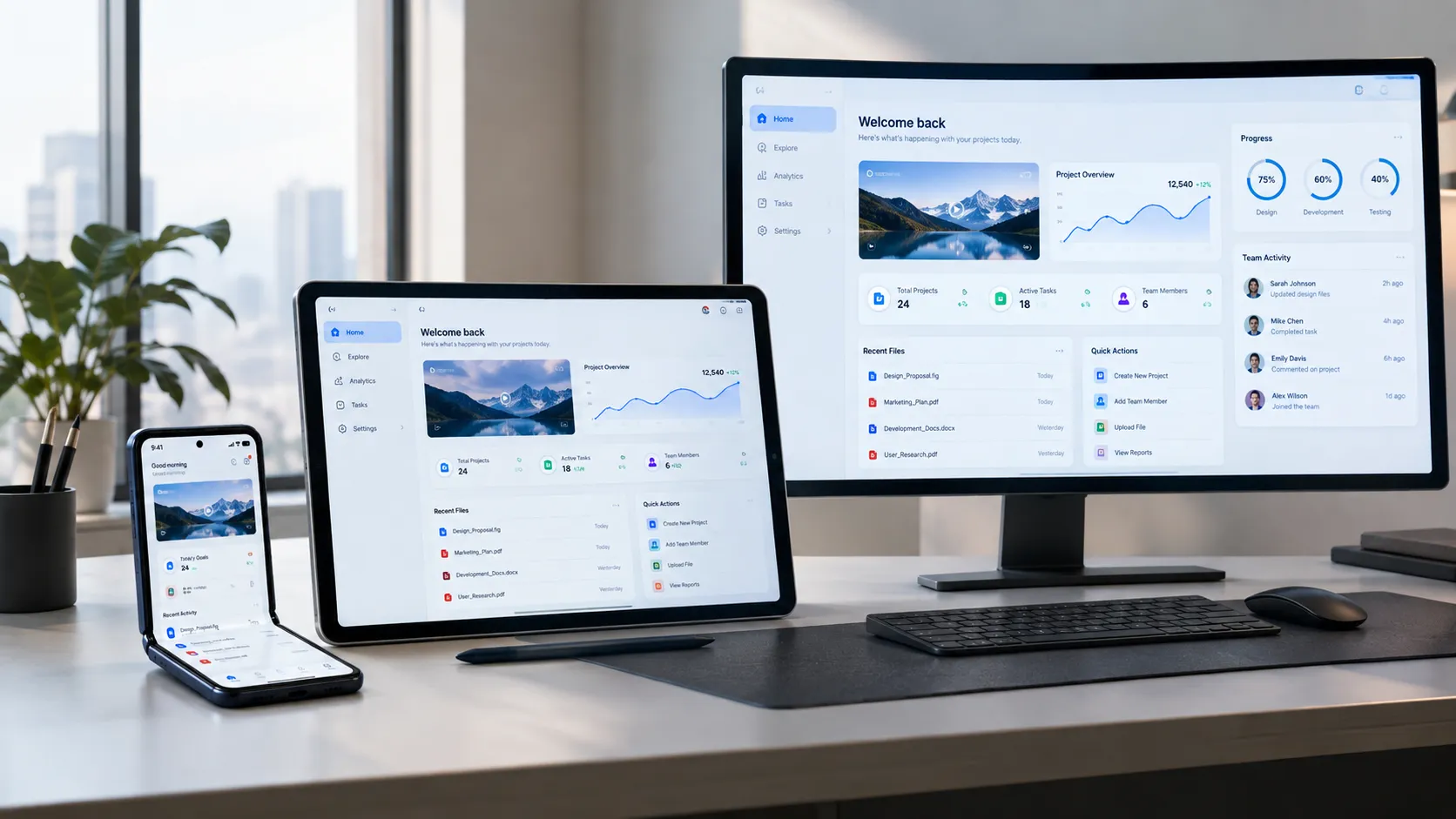
As foldable devices gain popularity, the way we design Android apps is evolving. In 2026, these devices are more than a novelty; they're reshaping mobile experiences. With screens that blend phone and tablet dimensions, opportunities for creative, engaging designs have never been greater.
Navigating this landscape requires a keen understanding of new challenges. Designing for foldables, tablets, and desktop screens means thinking beyond traditional constraints. From leveraging foldable-specific features to ensuring seamless transitions across devices, the future of Android app design is complex and exciting.

Understanding the Foldable Revolution
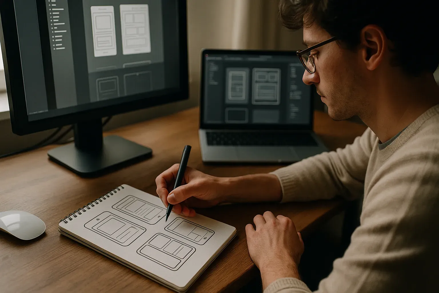
Foldable devices are no longer a futuristic concept. They've become an essential part of the tech ecosystem. By 2026, manufacturers like Samsung, Huawei, and others have made significant strides, creating diverse models with innovative hinge technologies and responsive displays. This diversity presents exciting opportunities for app designers who can think beyond the typical smartphone experience.
The rise of foldables is significant because it represents a shift in how users interact with devices. Foldables combine the portability of smartphones with the expanded screen space of tablets, challenging designers to create versatile experiences. Users expect seamless functionality whether the device is open or closed, making adaptive design a key element in 2026.
Design Challenges for Foldables
Foldable devices introduce specific design challenges. One major issue is creating interfaces that adapt smoothly to changing screen sizes. Apps must transition seamlessly between different states, from a phone-like layout to a tablet-like experience. This requires sophisticated responsive design techniques and meticulous testing across scenarios.
Another challenge is optimizing for the folded and unfolded states. Consistency in performance and appearance is critical. Designers need to account for hinge regions that might disrupt content. Balancing aesthetic appeal with practicality involves a nuanced understanding of hardware and user interaction.
- Screen transitions: ensuring smooth changes between states
- Hinge areas: accounting for non-interactive zones
- Performance consistency: maintaining speed and functionality across modes
Design Guidelines for Tablets
Designing apps for tablets involves distinct considerations. Tablets offer more screen real estate, allowing for richer and more immersive content. Designers must leverage this space to enhance user experience. Key considerations include optimizing layouts for touch interactions and ensuring readability across various lighting conditions.
Additionally, tablets often serve different use cases than smartphones, such as professional and educational applications. Designers need to consider multitasking capabilities and support for peripheral devices, like keyboards or styluses. Embracing these elements can set tablet applications apart in 2026.
- Enhanced layouts: for touch and reading comfort
- Multitasking design: optimizing for split-screen use
- Peripheral support: integrating keyboard and stylus features
Expanding to Desktop Screens
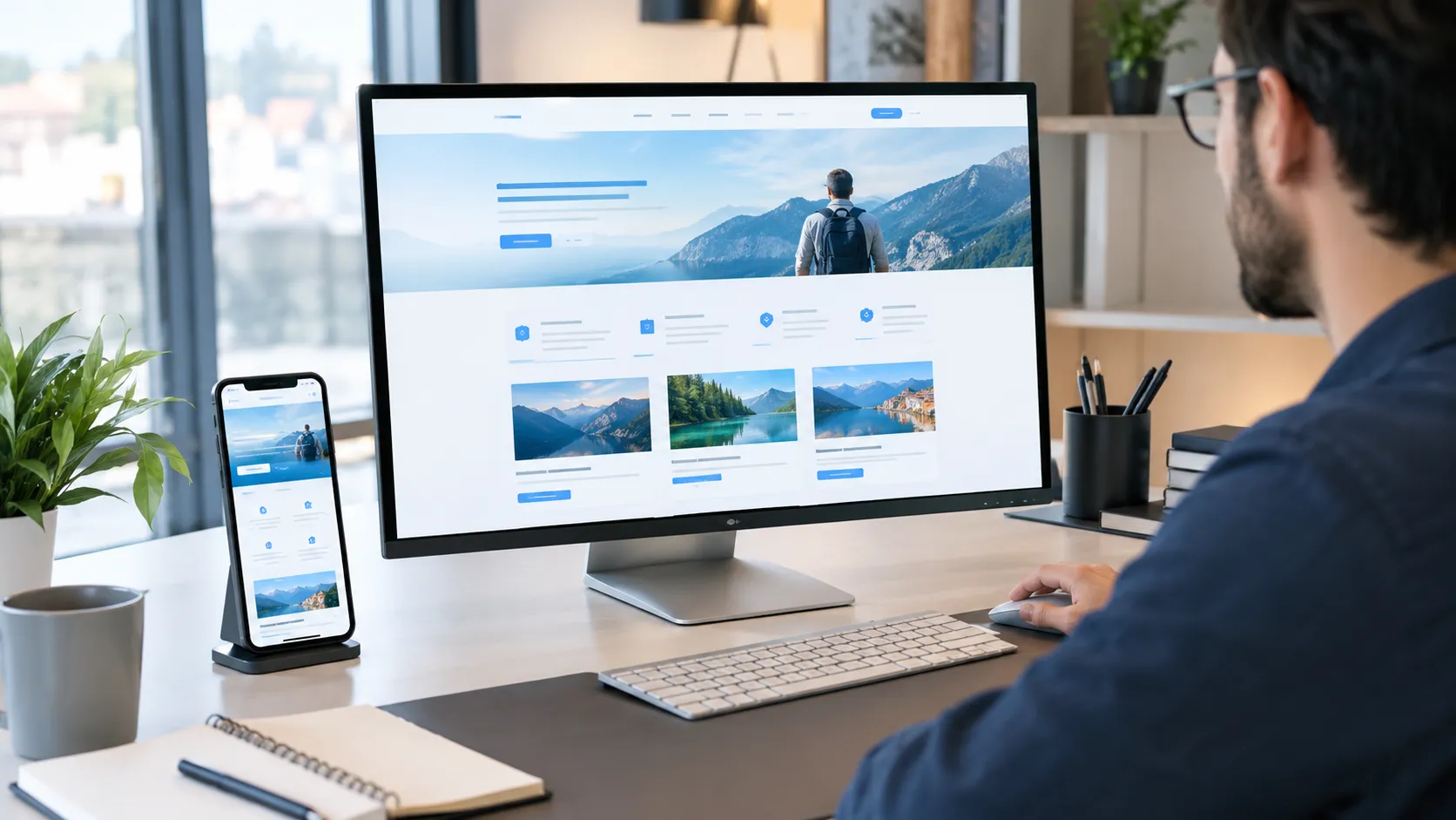
Bringing Android apps to desktop screens is a growing trend. This extension requires an approach that respects both mobile functionality and desktop expectations. Designers must reimagine interfaces for larger displays, ensuring elements like navigation and input feel intuitive across devices.
A crucial aspect is adapting touch-based interfaces for mouse and keyboard. Plus, desktops provide unique opportunities, such as using windowed modes for multitasking. Teams that balance mobile-oriented designs with desktop features can enhance user engagement.
Responsive Design Principles
Responsive design is at the core of multiscreen development. It ensures that an app's layout adapts to different screen sizes and orientations. Key principles include flexible grid layouts, fluid image use, and media queries that adjust styles based on device characteristics.
In 2026, designers need to push these principles further to accommodate foldables, tablets, and desktops. The challenge lies in maintaining a cohesive look and feel, offering a seamless experience from one device to another. This involves more than just resizing elements; it's about rethinking interactions and workflows.
- Flexible grids: adapt layouts for varied screens
- Fluid images: ensure images scale appropriately
- Media queries: apply styles specific to device
The Role of Material Design
Material Design is a guiding force in Android app development, offering a cohesive framework that supports consistency across devices. It provides designers with principles that enhance usability and aesthetic appeal, from motion and interaction to design hierarchy.
By 2026, Material Design has evolved to address the complexities of multiscreen environments. Designers benefit from regularly updated guidelines, allowing them to craft apps that function beautifully on foldables, tablets, and desktops. The result is an experience that feels native to each device while maintaining a recognizable brand identity.
Tools and Technologies for 2026
Developers have access to a wide range of tools for creating multiscreen apps. Technologies like React Native enable cross-platform compatibility, while Figma offers collaborative design tailored for varied screen sizes. These tools help teams implement responsive interfaces efficiently.
The technological landscape in 2026 provides robust options for testing and iteration. Platforms like AWS allow for scalable backend solutions, essential for apps handling diverse device interactions. Embracing these tools empowers designers and developers to push the boundaries of what's possible with Android apps.
| Tool | Purpose | Strengths |
|---|---|---|
| React Native | Cross-platform development | Ease of use |
| Figma | Design collaboration | Real-time updates |
| AWS | Backend solutions | Scalability |
| Android Studio | App building | Integrated environment |
Creating Adaptive User Interfaces
Adaptive user interfaces are vital for delivering a consistent experience across foldables, tablets, and desktops. These interfaces use flexible layouts and scalable elements, allowing the UI to adjust to screen size and orientation. Tools like Figma and Adobe XD offer responsive design features that enable designers to simulate and test adaptive layouts.
Developers need to integrate features like dynamic resizing and touch optimization to enhance usability. By utilizing media queries and breakpoints in CSS, designers can ensure that content reflows for optimal presentation. This anticipates user interactions on varying screen types, leading to more engaging and usable apps.
UX Trends in 2026
Several UX trends for 2026 are shaping the way apps are designed for diverse screen sizes. One of these trends is the increased use of gesture-based navigation, which enhances user interaction on foldables. Additionally, voice-activated interfaces are becoming integral, providing hands-free solutions and improved accessibility.
Another significant trend is the integration of AI-driven customization. Apps are utilizing AI to learn user preferences and adjust content dynamically. This results in a personalized experience that aligns with the user's behavior and needs, making the app more intuitive and user-friendly.
Gesture-based navigation: Intuitive gestures replacing traditional buttons.
Voice-activated interfaces: Hands-free interaction becoming standard.
AI-driven customization: Personalized content and user experiences.
Cost Considerations for Multiscreen Apps
Developing apps for multiple screen types entails various cost considerations. Design complexity increases as layouts must be tailored to each screen size. The demand for testing resources also grows since apps need thorough testing across devices. According to industry reports, typical development costs for a multi-screen app range from $50,000 to $150,000.
Choosing the right technologies, like React Native for cross-platform capabilities, can help optimize costs. It's crucial to consider not just initial development but long-term maintenance as device diversity evolves. These costs should be balanced against the potential reach of engaging broader audiences.
| Cost Factor | Impact |
|---|---|
| Design Complexity | High |
| Testing Resources | Medium |
| Technology Choices | Medium |
| Maintenance | High |
Testing Across Multiple Devices
Testing multiscreen apps requires a comprehensive strategy that covers various devices under different conditions. Emulators and real device testing should be combined to identify any UI discrepancies and performance issues. Automated testing tools like Selenium or Appium can streamline the process, reducing manual effort and increasing test coverage.
Consider employing device farms, which provide access to a wide range of physical devices for live testing. Ensuring compatibility and responsiveness across screens minimizes the risk of post-launch issues, maintains brand reputation, and ensures user satisfaction.
Case Studies: Success Stories
One standout example is the Samsung Galaxy Fold. Apps like Twitter and Spotify have successfully adapted their interfaces to embrace foldable features, offering seamless transitions between folded and unfolded states. Their designs focus on maintaining functionality while enhancing aesthetic appeal.
Another success story involves the productivity app, Microsoft 365. By adjusting interfaces to maximize real estate on tablets and foldables, Microsoft has ensured productivity tools remain accessible and efficient. These examples highlight the potential for innovative and user-friendly design.
Their designs focus on maintaining functionality while enhancing aesthetic appeal.
— Brandrums Editorial
How Brandrums Approaches Design
At Brandrums, our approach to multiscreen app design involves a blend of creativity and technology. We emphasize a deep understanding of consumer behavior across different devices. By leveraging tools like React Native and Figma, we deliver solutions that are flexible and future-ready.
Our team engages in early-stage prototyping, ensuring designs are iteratively refined. This method allows us to align with client visions effectively and achieve optimal user experiences. We consider all factors from brand identity to technical nuances, creating apps that resonate with users and stand out in the market.
Future-Proofing Your App Design
Future-proofing your app involves anticipating changes and being adaptable. This means designing with modular components that can be easily updated. Incorporating AI and machine learning can help apps remain competitive by providing predictive features that adjust to market demands.
Remain engaged with emerging technologies and industry trends. Regular updates and iterative testing ensure the app remains relevant and functional. By aligning design with technological advancements, your app is poised to serve users well into the future.
Frequently Asked Questions
Are foldable devices changing app design priorities?
Yes, foldable devices demand a shift in design priorities by emphasizing adaptive and flexible layouts. Developers need to create apps that seamlessly transition between folded and unfolded states. This includes ensuring smooth animations and maintaining functional user interfaces. Tools like Jetpack Compose can help streamline this process.
What are the main considerations when designing for tablets?
When designing for tablets, focus on providing optimized layouts that leverage larger screens. Consider multi-window support and adaptable UI components that enhance multitasking. Pay special attention to tablet-specific UX patterns to improve user engagement and maximize screen real estate. Material Design guidelines offer valuable insights.
How can I make my Android app design work on desktops?
To adapt Android apps for desktops, prioritize responsive design and keyboard and mouse input support. Implement flexible layouts and consider desktop-specific features like resizable windows. Use component libraries that support multi-screen designs, enhancing app usability across various devices. Think of how users interact differently on desktops compared to mobiles.
Is it more expensive to develop apps for multiple screen sizes?
Yes, developing for multiple screen sizes can increase costs due to additional design and testing phases. You may need specialized resources for each screen type. However, with careful planning and reusable components, you can mitigate expenses. Investing in adaptive design early can save long-term development costs.
What technologies are essential for creating foldable Android apps?
Key technologies include Jetpack Compose and Kotlin for responsive UI development. Use the Android Emulator to test foldable behavior and validate app performance. Foldable-specific APIs are crucial for managing screen states and transitions effectively. Staying updated with Android SDK releases helps optimize app functionality on new devices.
How do you test Android apps on foldables and tablets?
Testing Android apps on foldables and tablets requires using emulators and physical devices to ensure coverage. Focus on split-screen modes, app continuity, and responsive layouts. Look for UI glitches and performance issues when transitioning between displays. Regular feedback from real users can improve app reliability across different screens.
Tags
About the Author

Daniel Brooks
Daniel covers web development, artificial intelligence, product design, and the technology decisions that help modern businesses grow.