
You open a website on your phone, but the text is tiny. The buttons are difficult to tap, images extend beyond the screen, and you have to pinch and zoom just to read a paragraph.
Most people do not stay on a website like that for long.
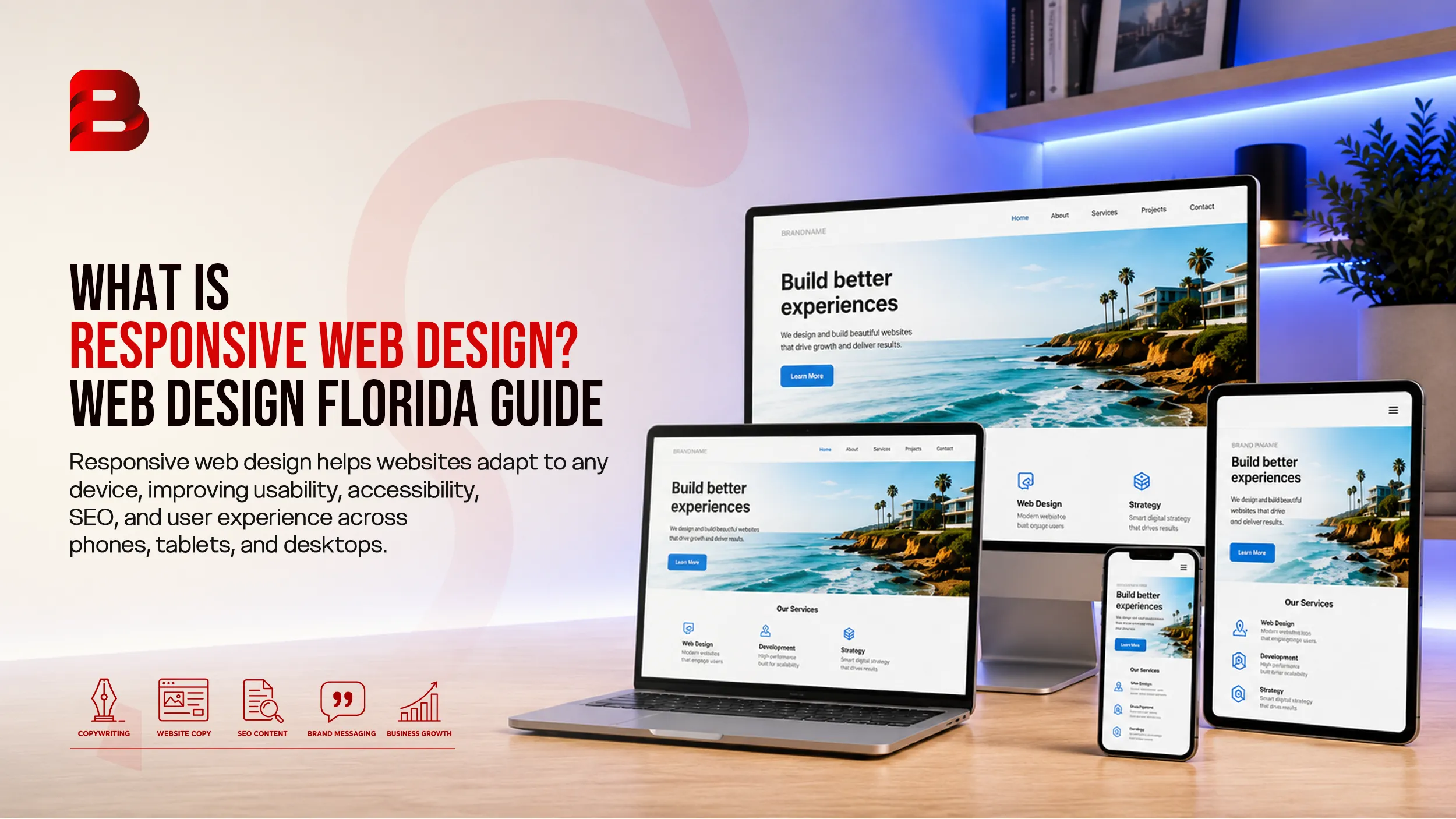
This is one of the problems responsive web design is intended to solve. Instead of creating a fixed layout for one screen size, responsive design allows a website's layout, images, typography, navigation, and other elements to adapt to the available screen space.
Responsive web design is now a standard approach to building websites that work across phones, tablets, laptops, desktops, and other screen sizes. MDN describes responsive web design as an approach that allows pages to render well across different screen sizes and resolutions.
For businesses researching web design florida, responsive design is an important concept to understand. However, the same principles apply to businesses in Arizona, Florida, and virtually any market where customers access websites from different devices.
This guide explains what responsive web design means, how it works, why it matters for SEO and accessibility, common mistakes to avoid, and how to choose the right approach for your website
Key Takeaways
Responsive web design allows a website to adapt to different screen sizes.
It is different from simply shrinking a desktop website for mobile users.
Flexible layouts, CSS media queries, responsive images, and appropriate typography are important parts of responsive design.
Google recommends responsive design as a mobile-friendly implementation approach.
Responsive design can support better usability, accessibility, and search visibility when implemented correctly.
A responsive website should be tested across different screen widths, not just on one phone and one desktop.
Good responsive design focuses on content, navigation, performance, and usability rather than device-specific pixel dimensions.
What Is Responsive Web Design?
Responsive web design is a method of designing and developing websites so their content and layout can adapt to the screen or viewport available to the visitor.
A responsive website does not have to maintain exactly the same visual arrangement on every device. Instead, elements can resize, reposition, stack, or reorganize when the available space changes.
For example, imagine a business website with three service cards displayed side by side on a desktop computer.
On a smartphone, keeping those three cards in one row would make each card extremely narrow. A responsive design can automatically change the layout to display the cards in a single column.
The content remains available, but the presentation changes to suit the available space.
That distinction is important.
Responsive design is not simply about making everything smaller. It is about creating a flexible interface that remains usable as the viewport changes.
MDN notes that responsive design uses techniques such as flexible layouts, media queries, responsive images, and responsive typography to support different screen sizes.
Responsive websites generally combine several technologies and design practices.
1. Flexible Layouts
A fixed-width website may be designed around a specific screen width. That can create problems when the visitor uses a smaller or larger display.
Responsive layouts instead use flexible sizing and modern CSS layout systems such as Flexbox and CSS Grid.
These technologies allow elements to grow, shrink, wrap, and reposition according to the available space.
For example:
Desktop:
Navigation | Content | Sidebar
Mobile:
Navigation
Content
Sidebar
The HTML content does not necessarily need to be duplicated. The visual layout can change through CSS.
2. CSS Media Queries
Media queries allow developers to apply different CSS rules depending on characteristics of the user's environment.
Viewport width is one common example.
A desktop layout might have multiple columns, while a narrower viewport could trigger a simpler arrangement.
Modern responsive design does not require developers to create a separate design for every phone model. Instead, breakpoints should generally be introduced when the content or layout begins to stop working well. MDN specifically recommends choosing breakpoints based on where the design needs to change rather than targeting every individual device size.
3. Responsive Images
Images can also create responsive design problems.
Suppose a website loads a very large desktop image onto a small smartphone. The image may consume unnecessary bandwidth and take longer to load.
Responsive image techniques allow browsers to select more appropriate image resources for different display conditions.
The web.dev guidance on responsive images notes that serving unnecessarily large images to mobile devices can use substantially more data than necessary.
This is particularly relevant for image-heavy websites, ecommerce stores, portfolios, and websites with large hero sections.
4. Responsive Typography
Text needs to work across different screen sizes as well.
A heading that looks balanced on a large monitor may dominate a smartphone screen.
Responsive typography can adjust font sizes, spacing, line height, and other properties to maintain readability.
The goal is not merely to make text smaller. It should remain comfortable to read without forcing users to zoom or scroll horizontally.
5. The Viewport Meta Tag
Responsive layouts also depend on the browser correctly interpreting the device viewport.
A commonly used viewport declaration is:
<meta name="viewport" content="width=device-width, initial-scale=1">
This tells mobile browsers to use the device width as the viewport width rather than relying on an older virtual viewport behavior.
Without the correct viewport configuration, a carefully designed responsive layout may not behave as expected on mobile devices.
Feature | Responsive Website | Non-Responsive Website |
|---|---|---|
Mobile layout | Adapts to available space | Often remains fixed |
Desktop layout | Flexible | Usually fixed |
Images | Can resize or use different sources | May overflow or become too large |
Navigation | Can reorganize for smaller screens | May become difficult to use |
Text | Can adjust for readability | May appear too small or large |
Horizontal scrolling | Generally minimized | More likely to occur |
Maintenance | Usually one website layout system | May require additional work |
SEO implementation | Works well with a single URL structure | Can become more complicated with separate versions |
Google recommends responsive web design as a mobile-friendly configuration because it can serve the same HTML and URL while allowing the presentation to change according to screen size.
Why Responsive Web Design Matters
A website is often the first place a potential customer interacts with a business.
If the experience is difficult on a smartphone, the problem is not limited to appearance. Poor usability can affect whether visitors can find information, complete forms, call a business, browse products, or understand what the company offers.
Better User Experience
Responsive design makes navigation and content easier to use across different devices.
A visitor should be able to:
Read the main content without unnecessary zooming.
Tap buttons comfortably.
Navigate menus without excessive effort.
View images without unwanted cropping or overflow.
Complete forms without struggling with tiny fields.
Access important information without horizontal scrolling.
A responsive website should make the device feel like a natural part of the experience rather than something the user has to fight against.
Easier Website Management
A responsive approach can also simplify website management because businesses can maintain one primary website rather than creating separate desktop and mobile URLs.
Google's mobile-first documentation identifies responsive design as one of the supported mobile configurations and recommends it as the easiest pattern to implement and maintain.
Stronger Accessibility
Responsive design and accessibility are closely connected, although responsive design alone does not guarantee an accessible website.
WCAG 2.2 includes a Reflow requirement that addresses whether content can be presented without loss of information or functionality and without requiring two-dimensional scrolling at certain zoom and viewport conditions.
That means developers need to think beyond screen size.
They also need to consider text scaling, keyboard navigation, contrast, focus states, touch targets, forms, semantic HTML, and other accessibility requirements.
Responsive Web Design and SEO
Responsive design does not automatically make a website rank well.
However, it creates a technical foundation that can support a better search experience.
Google uses the mobile version of a website's content for indexing and ranking through mobile-first indexing. Google also recommends responsive design for mobile-friendly websites.
This makes mobile usability an important consideration for SEO.
One URL Structure
With responsive design, the same URL can serve visitors regardless of whether they use a desktop, tablet, or phone.
This can simplify:
Internal linking
Canonical management
Content maintenance
Analytics
Sharing
Search engine crawling
Google has specifically recommended responsive design over separate mobile URLs for new websites.
Better Mobile Experience
If important content is difficult to access on a mobile screen, users may struggle to interact with the website.
Responsive design helps ensure that navigation, content, forms, and calls to action remain usable across screen sizes.
Performance Still Matters
Responsive does not automatically mean fast.
A website can have a flexible layout and still load excessive JavaScript, oversized images, unnecessary fonts, or other heavy resources.
Performance should therefore be treated as a separate but related concern.
Google recommends paying attention to page experience and provides tools such as Search Console and PageSpeed Insights for monitoring performance.
Responsive Design and Accessibility
A professional responsive website should accommodate more than different device sizes.
It should also accommodate different ways of interacting with digital content.
For example, someone may enlarge text because they have difficulty reading small content. If the page responds poorly to enlarged content, important information may become hidden or require awkward horizontal scrolling.
WCAG 2.2's Reflow criterion specifically addresses presenting content without loss of information or functionality and without unnecessary two-dimensional scrolling at a 320 CSS pixel width for vertically scrolling content.
Responsive development can support this goal through techniques such as CSS Grid and Flexbox, which allow page sections to reflow as the available space changes.
However, accessibility requires a broader process.
A website should also be checked for:
Keyboard accessibility
Proper heading structure
Meaningful link text
Form labels
Focus indicators
Color contrast
Alternative text for appropriate images
Accessible navigation
Readable typography
Responsive design is one part of a usable website, not the entire accessibility strategy.
What Makes a Website Truly Responsive?
A website is not truly responsive just because it technically fits on a phone.
A stronger responsive implementation considers the complete user journey.
Navigation
Desktop navigation may have enough room for several menu items.
On mobile, those same items may need to move into a menu or another compact navigation pattern.
The important thing is that users can still reach the site's key pages easily.
Buttons and Forms
Buttons should remain easy to tap.
Forms should not require users to zoom in to enter information.
For a service business, this is especially important for contact forms, quote requests, appointment forms, and phone links.
Content Hierarchy
A responsive layout should preserve the order and importance of information.
A primary call to action should not disappear below unnecessary decorative elements simply because the screen became smaller.
Images and Media
Images should resize appropriately and should not create horizontal overflow.
For larger sites, responsive image techniques can also help browsers load image resources better suited to the user's device.
Typography
Text should remain readable at different viewport sizes.
Developers can adjust font sizes, spacing, widths, and line heights to maintain a comfortable reading experience.
Responsive Design Examples
Consider a local Arizona home-services company.
On a desktop screen, its homepage might display:
Hero Section
Headline | Image
Services
Service 1 | Service 2 | Service 3
About
Text | Image
Contact
Form | Business Information
On a smartphone, the same page could become:
Hero
Headline
Image
CTA
Services
Service 1
Service 2
Service 3
About
Image
Text
Contact
Form
Business Information
Nothing important has to disappear. The arrangement simply changes to fit the available space.
The same concept applies to ecommerce stores, law firms, healthcare organizations, restaurants, professional services, SaaS businesses, and nonprofit websites.
Common Responsive Web Design Mistakes
Responsive websites can still be poorly designed.
Here are several problems worth checking before launching a website.
1. Designing Only for Popular Devices
It is tempting to test only an iPhone and a desktop monitor.
That is not enough.
People use different screen widths, browser settings, orientations, zoom levels, and input methods.
Instead of designing for a fixed list of devices, test where the content itself begins to break.
2. Using Fixed Widths Everywhere
Hard-coded dimensions can cause content to overflow smaller screens.
Flexible sizing, appropriate maximum widths, and responsive layout techniques are generally more suitable for modern websites.
3. Oversized Images
A responsive image that visually shrinks can still be a large file.
The browser may display it at a smaller size while downloading a much larger resource.
Responsive image delivery and image optimization can reduce unnecessary data transfer.
4. Tiny Mobile Text
Shrinking everything to fit the screen is not responsive design.
Text needs to remain readable.
5. Desktop-First Thinking
A complex desktop layout can be difficult to squeeze into a smartphone.
A mobile-first approach starts with the smallest practical layout and progressively adds complexity as more screen space becomes available. MDN identifies mobile-first design as a common responsive approach.
6. Ignoring Forms
A website may look excellent until someone tries to submit a form on a phone.
Check:
Field size
Spacing
Input types
Error messages
Keyboard behavior
Submit button accessibility
The form is part of the responsive experience.
How to Choose a Responsive Web Design Approach
If you are planning a new website or redesign, start with your users rather than the technology.
Step 1: Identify Your Main Visitors
Ask:
Who visits the website?
What devices do they commonly use?
What information do they need?
What action do you want them to take?
Which pages matter most?
For an Arizona service business, the priority might be phone calls and quote requests.
For an ecommerce company, product discovery and checkout may matter more.
Step 2: Map the Important Content
List your core pages and determine what users need from each one.
Typical business websites include:
Homepage
About
Services
Service detail pages
Contact
FAQ
Blog
Testimonials or case studies
Do not design around decorative elements before deciding what information users actually need.
Step 3: Plan the Mobile Experience
Ask what happens when the available width is reduced.
Does the navigation still work?
Do headings remain readable?
Do images fit?
Can visitors complete forms?
Can users identify the next action?
Step 4: Design Flexible Components
Use flexible layouts instead of creating a separate fixed design for every device.
CSS Grid, Flexbox, relative sizing, responsive typography, and media queries can work together to achieve this.
Step 5: Test Before Launch
Test the website at multiple widths.
Do not only ask whether it "looks good."
Test actual tasks:
Open the menu.
Find a service.
Read an article.
Submit a form.
Click a phone number.
Navigate back to the homepage.
Zoom in.
Rotate the device.
Check images.
Test keyboard navigation.
This approach reveals practical problems that visual inspection alone can miss.
How Much Does Responsive Web Design Cost?
There is no universal price for responsive web design.
The cost depends on factors such as:
Number of pages
Custom design requirements
CMS or platform
Ecommerce functionality
Integrations
Content requirements
Animation
Accessibility requirements
SEO requirements
Custom development
Existing website condition
A simple informational website will usually require less design and development work than a large ecommerce platform with hundreds of products and multiple integrations.
Instead of choosing a provider based solely on a package price, compare what is actually included.
Ask whether the project covers:
Responsive design
Mobile testing
Desktop testing
Content migration
SEO basics
Performance optimization
Accessibility considerations
Forms
Analytics
Post-launch support
A low initial price can become expensive if essential work is excluded
How to Get Started With Responsive Web Design
If you already have a website, you do not necessarily need to replace everything.
Start with an audit.
Check the website on several screen widths and identify:
Horizontal scrolling
Broken navigation
Tiny text
Overlapping elements
Slow-loading images
Difficult forms
Poor spacing
Missing content on mobile
Unusable buttons
Layout shifts
Then prioritize issues based on their impact.
If the homepage is difficult to use on mobile, fixing that experience may be more valuable than changing a minor desktop design detail.
For a new website, establish responsive behavior during the design and development process rather than treating mobile optimization as a final adjustment.
If you are planning a redesign and want to evaluate your current website first, a professional responsive-design audit can identify layout, usability, and technical issues before development begins.
How Brandrums Can Help
Brandrums provides web design and development services focused on creating websites that are user-friendly, adaptable, and suitable for different devices. Its web design service highlights responsive layouts, accessible interfaces, and optimized code and images.
The company also provides WordPress and ecommerce website solutions, allowing businesses to choose an approach based on their website requirements rather than relying on a single platform.
For a business owner, the important question is not simply whether a provider can make a website "mobile-friendly."
Ask how the team plans to handle content hierarchy, navigation, performance, forms, accessibility, SEO, and testing across different viewport sizes.
If you are comparing web design florida providers or researching website options for an Arizona business, use those questions as part of your evaluation.
A good website should fit the business and its audience, not simply fit inside a phone screen.
Conclusion
So, what is responsive web design?
It is an approach to website design and development that allows a site's layout and content to adapt to different screen sizes and viewing conditions.
The technology behind it includes flexible layouts, CSS Grid, Flexbox, media queries, responsive images, responsive typography, and proper viewport configuration. But the concept is broader than code.
Good responsive design means visitors can comfortably find information, navigate pages, interact with forms, read content, and complete important actions regardless of the device they use.
For businesses in Arizona and elsewhere, that makes responsive design an important part of building a practical online presence.
Whether you are researching web design florida, planning a new website, or improving an existing one, start with the user experience. Then choose the technology and design system that supports it.
The best responsive website is not the one that looks identical everywhere. It is the one that works well wherever your audience happens to be.
FAQ Section
Frequently Asked Questions
1. What is responsive web design in simple terms?
Responsive web design means creating a website that automatically adapts its layout and content to different screen sizes. A responsive site can reorganize navigation, resize images, adjust typography, and change column layouts so the website remains usable on phones, tablets, laptops, and desktops.
2. Why is responsive web design important for SEO?
Responsive design supports SEO by providing a mobile-friendly experience while allowing the same URL and HTML content to serve different devices. Google uses mobile-first indexing and recommends responsive design as a mobile-friendly implementation approach.
3. Is responsive design the same as a mobile-friendly website?
The terms are related but not identical. A mobile-friendly website is generally usable on mobile devices, while responsive web design is a specific implementation approach where the layout adapts to the available viewport.
4. What technologies are used in responsive web design?
Responsive websites commonly use flexible CSS layouts such as Flexbox and Grid, media queries, relative sizing, responsive images, responsive typography, and the viewport meta tag.
5. Does responsive web design improve website speed?
Responsive design alone does not guarantee faster loading. However, responsive image techniques, optimized assets, efficient code, and appropriate resource delivery can reduce unnecessary downloads and improve performance.
6. How do I know if my website is responsive?
Open the website on different screen sizes and look for problems such as horizontal scrolling, overlapping content, tiny text, broken navigation, oversized images, and difficult forms. You can also use browser developer tools to simulate different viewport sizes.
7. Should a small business use responsive web design?
Yes. A small business can benefit from a website that works consistently across mobile and desktop devices. Responsive design can also simplify website management because one website can serve users across different devices.