Imagine someone lands on your website after searching for your service. They spend a few seconds looking at the page, but they cannot immediately tell what you offer, why they should choose you, or what to do next.
So they leave.
Your website may have a polished design, professional images, animations, and a long list of services. Yet none of that matters if visitors cannot move confidently toward an action.
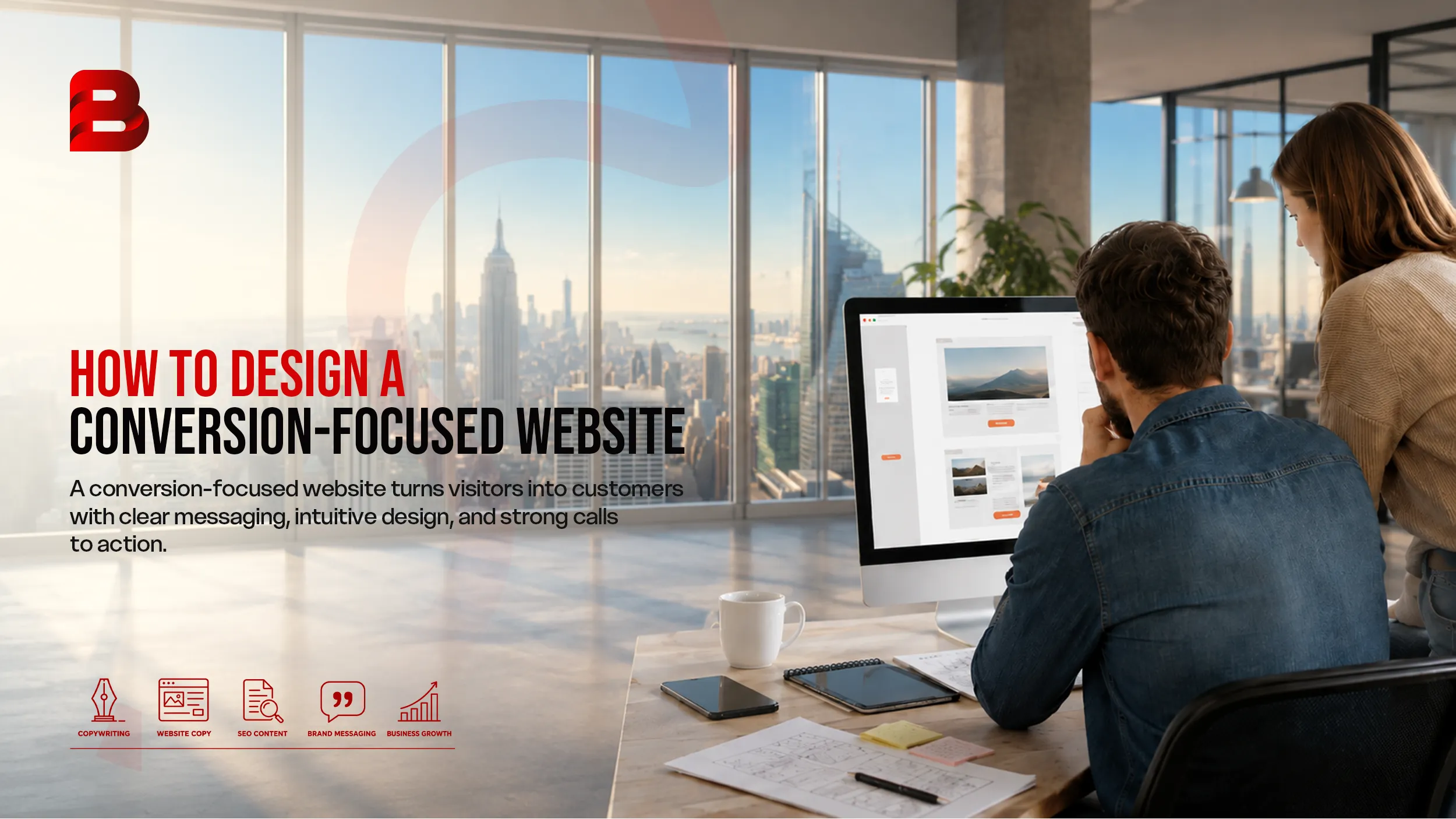
A conversion-focused website is designed around that action.
The goal might be a phone call, consultation request, quote form, product purchase, demo booking, newsletter signup, or another business objective. The design should make that next step obvious without making visitors feel pressured.
For businesses researching website development services USA, this distinction is important. A website should not simply represent your brand. It should support your marketing, search visibility, sales process, and customer journey.
This guide explains how to design a conversion-focused website from the ground up, including strategy, page structure, UX, CTAs, trust signals, performance, mobile design, testing, and common mistakes.
Key Takeaways
Every important page should have a clear primary purpose.
Your design should follow customer intent rather than personal design preferences.
Strong messaging and visual hierarchy help visitors understand the next step.
CTAs should be specific, visible, and consistent with the user's stage in the buying journey.
Trust signals should appear near important conversion points.
Mobile performance and Core Web Vitals should be treated as part of the design process.
Conversion optimization should continue after launch through analytics and testing.
What Is a Conversion-Focused Website?
A conversion-focused website is built to encourage visitors to complete a specific business action.
That action depends on the business.
For an accounting firm, it might be scheduling a consultation. For a SaaS company, it could be starting a free trial. An ecommerce store may focus on purchases, while a contractor may want quote requests and phone calls.
The important point is that conversion-focused design starts with the desired outcome.
A visually attractive website is not automatically a high-converting website. Good conversion design combines:
Clear positioning
Intuitive navigation
Relevant content
Strong visual hierarchy
Useful calls to action
Trust signals
Fast performance
Mobile usability
Simple conversion paths
Measurement and testing
Conversion-centered design research commonly emphasizes focus, structure, consistency, benefits, attention, trust, and friction reduction.
In other words, the website should answer three questions quickly:
What do you offer?
Why should I care?
What should I do next?
If visitors have to figure those things out themselves, the design is creating unnecessary friction.
Start With a Clear Conversion Goal
Before choosing colors, layouts, animations, or fonts, define what a successful visit looks like.
A website can have several conversion actions, but each important page should have a dominant objective.
For example:
Page Type | Primary Goal | Suitable CTA |
|---|---|---|
Homepage | Help visitors enter the right journey | Explore Services |
Service Page | Generate qualified inquiries | Request a Consultation |
Product Page | Encourage purchase | Add to Cart |
Landing Page | Drive one specific action | Get a Quote |
Case Study | Build confidence | Discuss Your Project |
Contact Page | Generate inquiries | Send Inquiry |
Blog Post | Move interested readers deeper | Explore Our Services |
Think in Terms of Conversion Paths
Instead of asking, "What should this page look like?" ask:
Where did the visitor come from?
What information do they need now?
What objection might stop them?
What action should they take next?
This creates a logical journey from search or advertising through information, trust, and action.
Understand Your Audience Before Designing
Conversion-focused design is easier when you understand the person using the website.
Start by identifying:
Who is the ideal customer?
What problem are they trying to solve?
What service or product are they comparing?
What concerns could prevent them from buying?
What information do they need before contacting you?
Are they ready to buy or still researching?
What device are they likely to use?
What would make them trust your business?
Consider a U.S. business owner searching for a web development partner.
They may not simply want "a beautiful website."
They could be concerned about:
Project cost
Delivery time
Technical quality
SEO readiness
Mobile responsiveness
Security
Ongoing maintenance
Communication
Integration with existing systems
Whether the developer understands their industry
Your website should address those concerns naturally.
That is why effective website design is closely connected to content strategy and customer research. The interface should make the right information easy to find.
Build a Website Structure Around User Intent
Navigation should help visitors understand where they are and where they can go.
A typical service-business website might include:
Home → Services → Individual Service → Process → Proof → Contact
An ecommerce website may require a different architecture:
Home → Category → Product → Cart → Checkout
The structure should reflect how people make decisions.
Avoid organizing everything around internal company terminology. Your visitors may not understand it.
For example, a navigation item called "Solutions" could be less clear than "Web Development Services" if the latter is what the audience actually searches for.
Keep Important Information Accessible
Visitors should not need to hunt for basic answers.
Important information may include:
What you provide
Who you serve
Pricing approach
Service areas
Process
FAQs
Contact options
Reviews
Credentials
Relevant work
Guarantees or policies where applicable
Good navigation is not about adding more menu items. It is about making the important ones easier to understand.
Create a Homepage That Explains the Value Quickly
Your homepage often receives visitors with very different levels of awareness.
Some know your brand. Others arrived through Google. Some may have seen an advertisement. Others may have been referred by someone.
Your opening section needs to orient them quickly.
A strong hero section generally includes:
A clear headline
A concise supporting statement
A relevant visual
A primary CTA
Optional supporting trust information
Instead of writing a vague headline such as:
"Building Digital Experiences for the Future"
consider something more specific:
"Custom Websites Built to Generate More Qualified Leads"
The second version tells visitors what the company does and why it matters.
Focus on Benefits, Not Just Features
Features describe what something contains.
Benefits explain why the visitor should care.
For example:
Feature: Mobile-responsive website
Benefit: Visitors get a consistent experience across phones, tablets, and desktops.
Feature: CRM integration
Benefit: New leads can move into your existing sales workflow without manual entry.
This distinction can dramatically improve the usefulness of website copy.
Use Visual Hierarchy to Guide Visitors
Visitors rarely read every word on a web page.
They scan.
That makes visual hierarchy essential.
Important information should receive stronger visual emphasis through:
Heading size
Position
Spacing
Contrast
Typography
Button placement
Supporting imagery
The objective is not to make everything stand out.
If everything is emphasized, nothing is emphasized.
A better approach is to establish a hierarchy:
Primary: Main message and CTA
Secondary: Benefits and supporting information
Tertiary: Detailed explanations, technical information, and additional resources
Whitespace also matters. Crowding every section with text, cards, icons, and buttons can make a website harder to process.
A cleaner interface gives important information room to breathe.
Write CTAs That Tell People What Happens Next
"Submit" is functional, but it tells visitors very little.
A stronger CTA communicates the action and, when possible, its value.
Examples include:
Request a Quote
Schedule a Consultation
Get a Project Estimate
Start Your Free Trial
View Available Services
Book a Demo
Talk to a Specialist
The best wording depends on the user's intent.
For a high-consideration B2B service, "Request a Consultation" may feel more appropriate than "Buy Now."
For an ecommerce product, "Add to Cart" or "Buy Now" may be more direct.
Make CTA Placement Logical
A CTA should appear where the visitor has enough information to act.
That may be:
Near the top of the page
After a benefits section
After relevant proof
Near pricing
At the end of the page
For long-form pages, repeating the same primary CTA can make sense when each placement follows a meaningful decision point.
The key is consistency, not repetition for its own sake.
Build Trust Before Asking for the Conversion
People rarely make important purchasing decisions based on design alone.
They want evidence.
Trust can come from:
Customer testimonials
Reviews
Case studies
Certifications
Industry memberships
Client logos, where appropriate
Clear company information
Transparent policies
Security indicators
Portfolio examples
Relevant statistics that can be verified
For a service business, case studies can be especially useful because they show how the company approaches real problems.
Do not create fictional testimonials or exaggerated claims. A conversion-focused website still needs credible information.
Put Trust Near the Decision Point
Trust signals are most useful when they appear close to an action.
For example, a consultation form could include a short reassurance about what happens after submission.
An ecommerce checkout could provide clear information about payment, delivery, and returns.
The principle is simple:
Answer the concern when the concern is most likely to arise.
Design Forms That Reduce Friction
Forms are often where conversions are lost.
A business may ask for:
Full name
Company
Job title
Phone
Email
Address
Website
Budget
Industry
Number of employees
Project details
Several custom questions
That may provide useful information internally, but it can also create unnecessary effort for the visitor.
Ask for what you genuinely need at that stage.
For an initial consultation, a shorter form might require only:
Name + Email + Project Requirement
Additional information can be collected later.
Make Form Feedback Obvious
Users should know whether their form submission worked.
Show a clear confirmation message and explain what happens next.
For example:
"Thanks. Your request has been received. Our team will review your project details and contact you about the next step."
This is better than leaving the user wondering whether the button worked.
Make the Website Fast and Mobile-Friendly
Performance is not just a technical concern.
It affects the experience people have while trying to use your website.
Google recommends paying attention to Core Web Vitals, including:
LCP: Aim for 2.5 seconds or less.
INP: Aim for 200 milliseconds or less.
CLS: Aim for 0.1 or less.
These thresholds represent Google's recommended targets for good user experience.
Google also recommends considering the overall page experience, including mobile usability, HTTPS, and avoiding intrusive elements that interfere with the main content.
Design for Mobile First
Google uses the mobile version of a website's content for indexing and ranking under mobile-first indexing. Responsive design is one recommended way to support different screen sizes.
That means mobile design should not be an afterthought.
Check:
Navigation
Font sizes
Button spacing
Form fields
Image sizes
Page speed
Sticky elements
Pop-ups
Checkout flows
Tap targets
A website can look excellent on a large monitor and still provide a frustrating experience on a phone.
If you are investing in website development services USA, mobile usability and performance should be part of the project requirements from the beginning.
Connect SEO With Conversion-Focused Design
SEO and conversion optimization should not operate as separate projects.
Organic search brings visitors.
Conversion-focused design helps those visitors take action.
The two work best together.
For example, a service page targeting a commercial keyword should not simply contain the keyword repeatedly. It should answer the visitor's questions and provide a logical next step.
A strong service page may include:
Clear service description
Customer problems
Benefits
Process
Relevant features
FAQs
Proof
Supporting resources
Internal links
CTA
This structure helps both users and search engines understand the page.
Google's guidance also emphasizes creating useful content and providing a strong overall page experience rather than attempting to optimize one isolated ranking factor.
Think Beyond the Homepage
One common SEO mistake is treating the homepage as the only important conversion page.
Your website may receive organic traffic through:
Service pages
Location pages
Product pages
Blog posts
Comparison pages
Resource pages
Case studies
Each page should have an appropriate conversion path.
A blog visitor may not be ready to request a quote immediately. They may first want another article or a relevant service page.
That is where contextual internal linking becomes valuable.
Conversion-Focused Design: Template vs Custom
Both templates and custom websites can work.
The right choice depends on the complexity of the business, the required functionality, budget, and growth plans.
Factor | Template Website | Custom Website |
Initial setup | Usually faster | Usually requires more planning |
Design flexibility | Often limited | High |
Conversion strategy | May require adaptation | Can be built into the architecture |
Scalability | Depends on platform | Can be designed around future requirements |
Integrations | Platform-dependent | Can be tailored to business systems |
Brand differentiation | Often lower | Higher |
Technical control | Varies | Generally greater |
Best suited for | Simple websites and quick launches | Complex, growth-focused websites |
A template is not automatically bad.
For a small business with a straightforward offer, it may be perfectly reasonable.
But if your website is central to lead generation, SEO, sales, integrations, and customer acquisition, a more tailored approach may provide greater control.
How to Choose a Website Development Partner
Choosing a development partner should involve more than looking at a portfolio.
Ask how the provider approaches the project.
1. Do They Start With Business Goals?
A good partner should want to understand your objectives before discussing visual details.
2. Do They Understand UX and Conversion?
Development alone does not guarantee a website that converts.
Ask how they plan page structure, user journeys, CTAs, forms, and testing.
3. Can They Explain Their Technical Decisions?
You do not need to understand every line of code.
But your development team should be able to explain why a particular platform, architecture, integration, or performance approach makes sense.
4. Do They Consider SEO From the Beginning?
Retrofitting technical SEO after launch can create unnecessary work.
Discuss:
URL structure
Indexability
Metadata
Heading structure
Internal linking
Schema
Performance
Mobile experience
Redirects
5. How Will Success Be Measured?
Ask what happens after launch.
A serious conversion strategy should have measurable goals.
For example:
Form submissions
Qualified leads
Phone calls
Demo bookings
Purchases
Revenue
Conversion rate
Funnel completion
If you are comparing website development services USA, evaluate the strategy behind the service, not only the visual portfolio.
How to Measure Website Conversions
A website cannot be optimized effectively if you do not know what users are doing.
Start by defining conversion events.
For a lead-generation website, you might track:
Visitor → Service Page → Contact Form → Confirmation → Qualified Lead
For ecommerce:
Visitor → Product Page → Add to Cart → Checkout → Purchase
Then monitor where users drop off.
Useful metrics can include:
Conversion rate
Form completion rate
CTA clicks
Qualified leads
Revenue per visitor
Checkout completion
Landing-page performance
Mobile vs desktop conversion rate
Organic conversion rate
Do not optimize solely for traffic.
A page receiving fewer visitors but generating more qualified leads may be more valuable than a high-traffic page with little commercial impact.
Use Testing Carefully
Testing can involve:
CTA wording
Headlines
Form length
Page layout
Pricing presentation
Supporting proof
Images
Navigation
Landing-page structure
However, avoid changing everything simultaneously.
If you change the headline, CTA, form, page structure, and offer at the same time, it becomes harder to understand what caused the result
Common Conversion Design Mistakes
Mistake 1: Designing for the Business Instead of the Customer
Your internal organization may make perfect sense to your team.
That does not mean it makes sense to a first-time visitor.
Use customer language wherever possible.
Mistake 2: Making the Homepage Do Everything
A homepage does not need to contain every detail about your company.
Its job is to orient visitors and direct them toward relevant journeys.
Mistake 3: Using Too Many CTAs
If every section has a different action, visitors may not know which one matters.
Create a clear hierarchy.
Mistake 4: Hiding Important Information
Do not force users through multiple pages to find basic answers.
If price ranges, service details, process information, or contact options are important to the buying decision, make them accessible.
Mistake 5: Ignoring Mobile Users
A mobile layout that technically works is not necessarily a good mobile experience.
Test real interactions, not just screen dimensions.
Mistake 6: Treating Speed as an Afterthought
Large images, excessive scripts, unnecessary animations, and poorly optimized third-party tools can create performance problems.
Performance should be considered during development, not only after launch.
Mistake 7: Confusing More Traffic With Better Results
SEO can increase visibility.
But if the website does not help visitors understand the offer and act, additional traffic may simply produce more non-converting visits.
Mistake 8: Never Testing After Launch
Launching the website is not the end of conversion optimization.
Visitor behavior changes. Offers change. Competitors change. Traffic sources change.
Your website should be treated as an ongoing business asset.
How to Get Started
If you are starting a new website or redesigning an existing one, use this sequence.
Step 1: Define the Primary Business Goal
Choose the action that matters most.
Step 2: Identify Your Main Audiences
Understand their problems, expectations, objections, and search behavior.
Step 3: Map the User Journey
Determine how people move from discovery to consideration and action.
Step 4: Plan the Site Architecture
Create the navigation and page structure before designing individual screens.
Step 5: Write the Core Messaging
Clarify the offer, benefits, differentiators, objections, and CTAs.
Step 6: Create Wireframes
Plan the information hierarchy before spending too much time on visual polish.
Step 7: Design for Mobile and Desktop
Make responsive behavior part of the original design.
Step 8: Develop With SEO and Performance in Mind
Build clean technical foundations, fast pages, accessible content, and measurable conversion events.
Step 9: Test Before Launch
Check forms, navigation, links, CTAs, responsive layouts, performance, analytics, and key user journeys.
Step 10: Measure and Improve
After launch, use real data to identify friction and prioritize improvements.
How Brandrums Can Help
A conversion-focused website requires more than attractive page layouts. It needs a connection between business objectives, user experience, content, technology, SEO, and measurable actions.
Brandrums can help businesses approach website development with those requirements in mind.
The process should begin with understanding what the website needs to accomplish, who it needs to serve, and how visitors should move through the site.
From there, the website can be structured around clear messaging, intuitive navigation, responsive design, conversion paths, and a technical foundation that supports long-term growth.
If your current website receives traffic but produces fewer inquiries or sales than expected, a conversion-focused redesign can be a practical place to investigate.
Brandrums can help businesses approach website development with those requirements in mind.
The process should begin with understanding what the website needs to accomplish, who it needs to serve, and how visitors should move through the site.
From there, the website can be structured around clear messaging, intuitive navigation, responsive design, conversion paths, and a technical foundation that supports long-term growth.
If your current website receives traffic but produces fewer inquiries or sales than expected, a conversion-focused redesign can be a practical place to investigate.
Your website should make the next step easier, not make visitors work to find it.
Conclusion
A conversion-focused website is not defined by a particular color palette, framework, animation style, or visual trend.
It is defined by how effectively it helps the right visitors move toward the right action.
That starts with a clear goal.
Then comes audience research, useful content, logical structure, strong visual hierarchy, relevant CTAs, trust signals, simple forms, mobile usability, technical performance, and continuous measurement.
For businesses evaluating website development services USA, these factors are more important than choosing a provider based solely on how impressive a portfolio looks.
A successful website should look professional, but it should also communicate clearly, remove friction, support search visibility, and create measurable business opportunities.
The best time to think about conversion is not after the website launches.
It is during the planning stage.
Frequently Asked Questions
1. What is a conversion-focused website?
A conversion-focused website is designed around specific business outcomes, such as generating leads, receiving inquiries, booking consultations, selling products, or collecting signups. Its structure, content, UX, and CTAs are planned to make those actions easier for visitors.
2. How do I make my website more conversion-friendly?
Start by clarifying the main goal of each page. Then improve the headline, value proposition, navigation, CTA placement, trust signals, forms, mobile experience, and page speed. Use analytics to identify where visitors leave and test improvements over time.
3. What makes a website convert visitors into leads?
Clear messaging, relevant offers, strong trust signals, simple forms, useful content, intuitive navigation, and visible CTAs all contribute. The most effective combination depends on the audience, industry, offer, and stage of the buying journey.
4. Should every website have multiple calls to action?
A website can have multiple CTAs, but each important page should have a clear primary action. Secondary actions should support the user's journey rather than compete with the main conversion goal.
5. Does website speed affect conversions?
Yes. Slow pages can create friction and make websites harder to use. Performance also contributes to overall page experience. Google recommends good Core Web Vitals, including LCP of 2.5 seconds or less, INP of 200 milliseconds or less, and CLS of 0.1 or less.
6. Is mobile-friendly design important for conversion optimization?
Yes. Many visitors interact with websites through smartphones, and Google uses the mobile version of websites for indexing and ranking under mobile-first indexing. Mobile layouts should therefore be tested for usability, navigation, forms, buttons, and performance.
7. How much do website development services in the USA cost?
There is no single reliable price because costs depend on the number of pages, functionality, integrations, design requirements, CMS or technology stack, ecommerce requirements, content, and ongoing support. A simple informational website can require far less development than a custom platform or complex ecommerce website. The best approach is to define requirements first and obtain a project-specific scope.